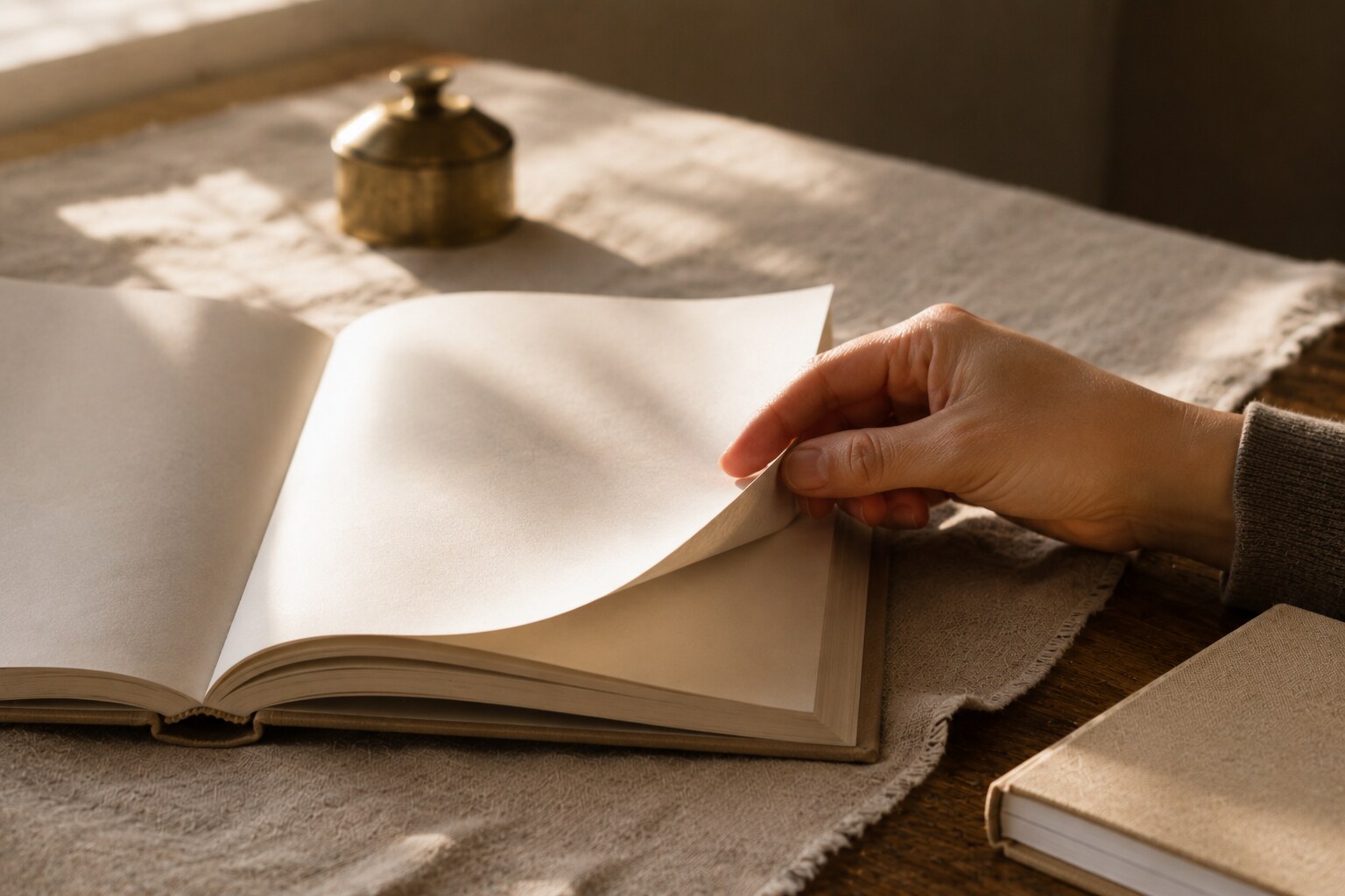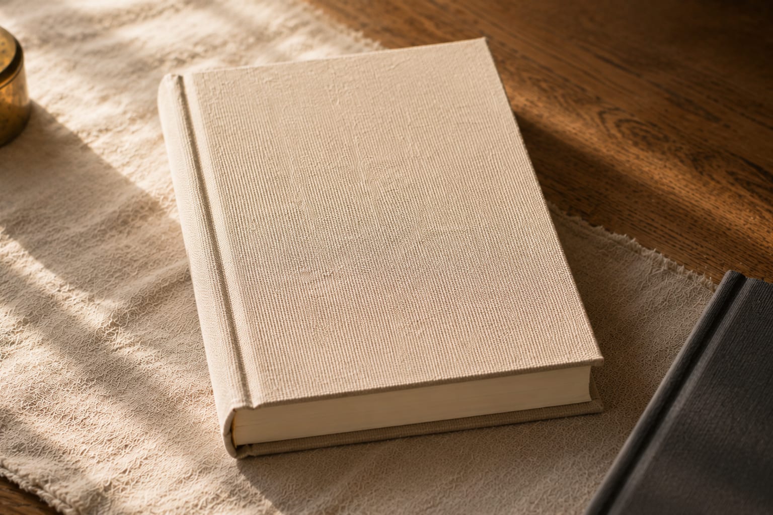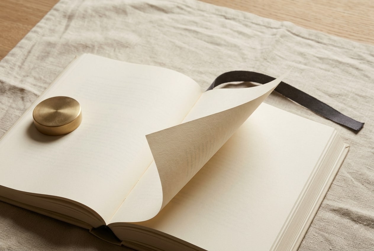
A book worth keeping is a printed object built to survive its own reading. The distinction is a set of design and material choices made at print time. The paper resists a weekly hand. The binding lies flat in a lap. The ink holds against a decade of window light. These are decisions that cannot be added to a book after it prints; the choice happens before the first press impression.
The five qualities that decide
A household's ordinary bookshelf holds two kinds of books. The first kind gets read once or twice and then finds its way to a box, a charity bag, a shelf in the spare room where books go to be forgotten. The second kind stays in the room the household lives in. It gets picked up on a Sunday afternoon. It gets handed to a visitor with the phrase "you have to see this." It survives a move, then another. A working typology of what separates the two comes down to five qualities that get baked in at production and cannot be retrofitted.
| Quality | What it holds against | The reading-life test |
|---|---|---|
| Heavy paper | The friction of daily reading | Turning a page without curl at year five |
| Considered binding | The stress of being opened again | Lying flat in a lap without cracking |
| Deep ink | A decade of ambient window light | The color at year ten looks like the color at year one |
| Editorial layout | The changing eye of the household | The page still reads clean at year fifteen |
| Cover treatment | Time on a shelf | The corners still hold their shape at year twenty |
The five qualities work together. A book that meets four of them can be salvaged by an editor's second pass at the fifth. A book that meets one or two is already headed for the spare room, regardless of the price tag on the back cover.
The rest of this essay is an argument about what each of the five actually looks like when it is done well, and how a household can read a book at print time to know which shelf it will end up on.
The paper: the working floor of the object
Paper is the load-bearing decision. Every other choice sits on top of it, and no other choice can compensate for getting it wrong.
The measurable properties that matter are weight, opacity, texture, and coating. Weight is measured in grams per square meter (gsm) internationally or in pounds (lb) in the US market. An 80-pound text weight sits at roughly 118 gsm and is the working floor for a book intended to be kept. Below that, the paper gets thin enough that print shows through from one side to the other and the page loses the confident heft the hand associates with permanence. Above 100-pound text, the book gets heavy in a way that makes it hard to read in a lap for more than a chapter. The band that most household-kept books settle in is 80 to 100 pound text, coated matte or uncoated depending on the register of the images. The case for the eighty-pound page is the fuller argument for that specific paper floor.
Opacity is the property that decides whether an image on one side of the page shows through as a ghost on the other. A well-made book uses paper opaque enough that a full-bleed color plate on page 7 leaves no impression on the reader of page 8. Print shops report opacity as a percentage. Above 92% is safely opaque for a book with photographic content on every page. Below 88% starts to show ghosting under warm reading light.
Texture is a more subjective property. Uncoated paper (also called offset) has a natural fiber texture that reads as literary and quiet. Matte-coated paper (also called silk) holds photographic detail more precisely without introducing a reflective sheen. Reflective coated paper is standard in magazine printing because it makes color pop under hard news-stand lighting, but under warm household window light the sheen becomes a reflection rather than a page.
Coating is where a lot of production tradeoffs get made. Uncoated paper feels warmer in the hand. Matte-coated paper carries a photograph more faithfully. Reflective coated paper reads as commercial. A book intended to be kept usually chooses uncoated for text-driven layouts and matte-coated for image-driven ones. Neither is right in the absolute; the register of the book decides.
The last invisible property is paper permanence. The ISO 9706 standard sets the specification for paper intended for long-term keeping: alkaline reserve, controlled lignin content, minimum tear resistance. Papers made to that standard resist the yellowing that low-alkaline papers show at year seven. A book meant to be a household keepsake for decades belongs on ISO 9706 paper or its equivalent, and the specification is usually available on request from a small printer even when it is not printed on the colophon.
The binding: how a book opens is its future
A book that will be read many times must open easily many times. That is a binding question, and binding choices are less flexible than paper choices because they interact with the entire manufacturing sequence.
The three binding families that matter for a household book:
Casewrap hardcover. A stiff board cover wrapped in printed paper or cloth, glued and sewn to the interior text block, with endpapers that hide the join. The casewrap is the standard for books intended to last decades. It resists shelf damage, holds its shape under stacking, and gives the object the weight and hand that a household associates with a real book. The short history of the casewrap cover is the fuller account of why this format has held its place since the 1830s.
Layflat hardcover. A hardcover binding engineered so the interior text block opens fully flat without the fold interrupting a two-page image. Layflat is more expensive and requires a printer with specific equipment. It is the correct binding for a book with photographic spreads that cross the gutter. The layflat is a working solution to the problem of the visible fold, and for a book that shows photographs edge-to-edge it is the right choice.
Softcover. A flexible cover glued (perfect-bound) to the interior text block. Softcovers are lighter, cheaper, and easier to carry. They work well for books meant to be read in a lap over a short reading window (a bedtime book for a child, a paperback novel). They are less well suited to the household keepsake use case because the perfect-bound spine cracks after enough openings and the covers curl at the corners with time. A well-made softcover on a coated cover stock can survive a decade of reading, but the softcover's active reading life is measurably shorter than the hardcover's.
The choice among the three is a household-use question. A book that will live in a specific room and get opened on a specific armchair asks for a hardcover. A book that will travel between houses in a bag asks for a softcover. A book with photographic spreads that cross the gutter asks for layflat regardless of price. Getting the binding wrong is one of the two most common ways a book that should have been kept ends up in the spare room.
The ink: color that survives a decade of window light
The ink question is the one buyers rarely think about at purchase and always notice at year seven.
Standard four-color process (CMYK) printing achieves roughly 70% of the visible color gamut. Expanded-gamut printing (using six or seven inks, sometimes with orange and green added to the CMYK set) covers around 85-90% of the visible gamut and reproduces a warm gold, a deep blue, and a saturated brown that CMYK cannot hit without approximation. For a book with photographic content in which color fidelity matters, expanded-gamut printing is the working floor of quality.
Ink stability is a separate question from ink gamut. Standard pigment-based process inks are lightfast for approximately 25 years under normal indoor conditions before showing measurable fade. Dye-based inks (still used in some home and low-tier commercial printing) can fade meaningfully within five years of ambient window light. A book intended to be kept belongs on pigment-based inks; the specification is usually visible in the printer's paper-and-ink dossier and can be requested.
The other invisible ink question is the ink weight, which is set at plate-setup time. A book printed with too little ink density reads as washed-out at year one and gets worse over time. A book printed with too much ink density reads as heavy and can crack along the fold at high-fold pages. The correct ink density is a proofing question that a good printer settles through iterative proofing with the editor. A book that was printed without a proofing round shows in the ink density at year three; a book that was printed with a considered proof holds its color.
The layout: durable design
The layout question is the one that goes wrong most often at the mid-market tier. A book can meet the paper, binding, and ink specifications above and still read as dated at year five because the typography, the margins, and the design choices were set in the visual language of the month it was made.
The design principles that survive:
Wide margins. A book with generous margins reads as considered rather than crowded. The rule of thumb from book-design manuals is that the inside margin (the gutter side) should be roughly 1.5 times the outside margin, and the outer margin should be roughly 1.5 times the top margin. Books that follow this proportion sit correctly in the hand; books that violate it feel cramped at year one and dated by year three.
Classic typography. A book set in a well-designed classical serif (Garamond, Caslon, Sabon, Baskerville, or a modern editorial revival of any of these) reads as timeless. A book set in a trend-of-the-year display face reads as dated within a year of the trend passing. The specific typeface choice is less important than the discipline of choosing a face designed for extended reading and setting it at a size (typically 10 to 12 point) that respects the eye.
Restraint in ornament. A book that uses one editorial device (a drop cap, a small caret, a single accent color) reads as considered. A book that uses six editorial devices at once reads as cluttered. Household bookshelves are patient. They reward the quiet book over the loud one, and the quiet book stays on the shelf longer.
Photographic layout that respects the fold. A book with photographs must decide how photographs interact with the gutter. Full-bleed photographs that cross the gutter demand a layflat binding. Photographs that stop before the gutter can live on standard hardcover. A book that puts a face across the gutter of a standard hardcover binding, with the face split by the fold, has an unforced layout error that no reader can un-see.
A grid the reader does not notice. The best editorial grid is invisible in the reading. It handles the recurring layouts (image + caption, chapter opener, running head, page number) consistently, so the reader stops noticing the design and starts noticing the content. A grid that is visible reads as design-forward and dates faster than a grid that is quiet.
The layout choice sits on top of the paper, binding, and ink choices. All four decide the book's ceiling; layout decides how long the book stays under it.
The reading life of a kept book
A book that meets all five qualities has a specific reading life that a household can recognize.
The five qualities decide the ceiling. Editorial fit decides how long the book stays under it.
The pattern of a kept book, observed across the households the Journal has watched: the first reading happens the week the book arrives. The second and third readings happen inside the first month. The book then settles into a rhythm of two or three openings per year, usually at moments the household associates with the book's subject. It survives one or two moves. It shows wear on the cover corners by year five, a soft impression at the spine by year ten, a faint patina at the page edges by year fifteen. It is still the book the household reaches for on the specific afternoon.
The market's evidence for that reading life is quiet but real. Wonderbly's Lost My Name personalized children's book, which established the modern personalized-book category, has sold over 4 million copies since 2014, most of them into households that report the book being read repeatedly across years. The category succeeds at the price tier where the book is bound and printed at a keepable specification, and it drops out where the specification does not support the household's reading habit.
For personalized pet books specifically, the reading-life question is what separates the category Pets & Pages works in from the disposable end of the market. A book intended to profile a specific companion belongs at the specification of a book intended to be kept. A book at the specification of a five-year keeping window will not survive the household's actual reading life, and the household will notice, usually by year three.
What separates the kept book from the discarded
The five qualities above compose into a working test the buyer can run at purchase.
- Feel the paper. An 80-pound uncoated or matte-coated page has a specific weight in the hand that a lower-weight paper does not have. If the page feels thin, the book is not built to be kept.
- Open the book to a middle page and lay it in the lap. A well-made hardcover lies substantially flat without hand pressure. A layflat lies completely flat. A softcover perfect-bind will resist and may crease. The reading-life implication follows from this test.
- Look at the color on a photographic page under warm window light. A book printed with pigment-based expanded-gamut inks holds a distinct warm gold, a saturated deep blue, and a range of brown. A book printed with standard CMYK on dye-based inks shows the color as approximate and, under warm light, slightly washed.
- Read a page of body text at ordinary reading distance. A book set in a classical serif at 10 to 12 point with generous margins reads clean without the eye working. A book set in a trend face at a heavy weight in narrow margins asks the eye to work, and the eye stops working after the first chapter.
- Look at the corners and the spine. A casewrap hardcover has crisp corners and a stiff spine that will hold their shape on a shelf. A perfect-bound softcover has softer corners and a spine that will show creasing by the third reading.
A book that passes the five tests is a book worth keeping. A book that fails two or more of them is a book that will find its way to the spare room.
The quiet truth of the category is that the specification of a kept book has been settled for over a hundred and fifty years. The tools change; the requirements do not. Heavy paper, considered binding, deep ink, durable layout, cover treatment that survives the shelf. Small presses that make books intended to last, and households that buy books intended to be kept, meet at the specification and produce the specific object that stays in the room.
A closing note on the object
The Journal will keep writing about the material choices that go into a book worth keeping, and the editorial choices about tense and character that decide whether the words on the paper deserve the paper they are printed on. Both halves of the argument matter. A book with beautiful materials and thin editorial is an object; a book with strong editorial on thin materials is a draft. The kept book is the one that meets both halves.
Small-press economics have caught up with the specification. It is now possible, at a household price tier, to print an individually composed book to the specification that has always defined a keepable object. Printed to order, made individually, on paper that meets ISO 9706, bound in a casewrap or layflat, set in a classical serif that will not date, in inks that survive a decade of window light. That is the book the Journal argues for, one essay at a time.